![]()
Don’t take this at face value. Please. Read on.

OK so my apologies – in advance. Sometimes things are just executed in a way that – well – is divergent from how I might do things. To each their own – I hope everyone is just out there doing their own thing creatively, hopefully in spite of their critics. I think it is interesting that we can pull ideas even from things we don’t necessarily like. Take this ugly shirt, for example. (Sorry – there it is). But I just happen to not like it. I think it is great if someone out there does. But I don’t.
HOWEVER…there are a few interesting ideas nestled in its design. I love the hand-rendered vibe of the pattern. I love the horizontal lines. I love that there seems to be a bit of mild chaos. Something about it keeps me engaged, if not thrilled. So we borrowed the ideas we liked and created a pattern for our office accent wall (which has *ahem* been blank for just under a year).
We met an incredibly talented Caroline Lizarraga (Decorative Artist: www.carolinelizarraga.com) at a few industry events recently. She was kind enough to come and say hello and a fun dialogue began about this wall idea and how she may help us execute it. I was slightly embarrassed at the onset to show her the image that inspired me. She didn’t know our work and may just think we lack taste. She definitely didn’t see it at first, but we collaborated and she went right on the journey with us. I explained what I liked about it and how it might work with our idea for our accent wall. We wanted something modern and brave, but also calm and innovative. The pattern certainly needed some tweaking. But we “used our words”, pinpointed what could be great, and got there with little difficulty. We toned down the pattern, worked with our existing color palette, and decided shimmerstone plaster was an edgy but sophisticated texture and graphic solution.
Combining our “MAS ideas” with Caroline’s classical training, we were excited to finally fill our space with an expression of our own. In the time since, we’ve gotten to know Caroline, and her adorable personality, fun and (dare I say, “inappropriate”, Caroline?) sense of humor fit right in here at MAS and only enhances her insane talent. We are absolutely thrilled with our new space and hope you all are, too! Many, MANY thanks to Caroline, and also to my incredible team who trusts me (and 100% enables me!) to run with a strange idea. Or two.


(It’s a step up from the art we created that was inspired by a pattern on a semi-truck, no?)
xo
Free shoes and cocktails. Not a problem.
I had a great time at the 7×7 Magazine party at DSW the other night. Loved the spontaneous drop-in by the talented designer Agustin Sanders! Always a blast with that one! Didn’t see much from the magazines, but hey, we always love free shoes and cocktails, so no complaints…
Trophy mantle.


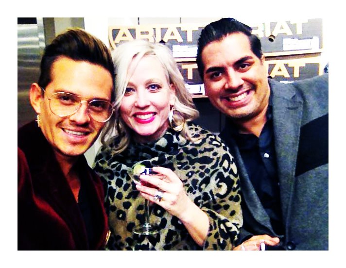
Team MAS has been out on the town! Doing some serious hob-nob-elbow-rubbin’ kind of networking. Trying to get out the good word about this new little start up that we call Mood and Space Design. (Side note – *we’re exhausted*). Industry events, although educational and certainly productive, can sometimes feel like a bit of a drain after a very long day. Not so at Ann Sacks San Francisco’s event in September, where Vicente Wolf was debuting his new tile line! (Which is stunning, by the way. Sculptural, elegant, modern but with a classic feel. Lovely. Check it out: Vicente Wolf for Ann Sacks)
We still can’t believe what a great time we had meeting Vicente! You know that we don’t design swoon often, and we know it’s not a good look. But we’re going to embrace our inner design nerds just this once because it was such a great experience for us. Vicente really does have incredible talent, and his combinations of contemporary minimalism with antiques allow for charm and elegance – a beautiful juxtaposition. Needless to say, we are extremely impressed. Doesn’t happen often.
But meeting him as a person – design aside – was a special treat for us. He was just simply human and took time to listen and to consciously mentor. We were particularly impressed with his approachable nature – and his sense of humor! We just may have enjoyed some, “off duty” language, directed with a sly grin, muttered under his breath. We are always thrilled to be in on an inappropriate joke or two!
We may have even charmed Vicente. He certainly charmed us. I do believe he gets it. You know, the grand “IT” in life – decency, humility, design, cocktails and a bit of cursing, when necessary…
…we admit that we are probably reading into things, but allow us this indulgence. Anyway, please enjoy these lemongrass-martini-laden photos. They’re going on our trophy mantle.
Thank you, Vicente!
Made in America. Twice.


We must give props for a good thing. MAS is installing Everett and Shilling Reclaimed Barnwood tile for a commercial project we are working on. We wanted to give a shout out to these guys for creating a truly successful sustainable product. The varied depths and lengths create a unique, “hand-rendered” texture. Not to mention its durability, dimensionality, and approachable good looks!
We are using the Boardwalk pattern (top image) in whitewash finish to bring a warm, welcoming aesthetic to a multi-use office building in SOMA. We think it is just perfect for our concept and especially for the creative character of the building users. Who wouldn’t want to interact with these instead of a generic white tile? Our concept for this project is “nostalgia”, so the low-key, outdoors vibe is perfect. (Chic nostalgia, no?) You’ll have to stay tuned if this concept perplexes you…
The reclaimed barnwood tiles have a low VOC finish, are a reclaimed product (Use it. Twice.) that gives a nice nod to the ranch history of the West, and are just simply comfortable. Like “going to work and wearing your fuzzy slippers” comfortable. We’re thrilled whenever we find a product with the rare combination of beauty AND brains, and can’t wait to show you the finished product.
E&S Tile also has a pretty fantastic upcycled wood tile collection – whitewashed image above – not from barns but various sources. I am not a fan of the term “upcycled” when the secondary product is not executed to an equal or preferably higher level, but this tile has earned the term…
Check these tiles out! Do good.
Word.
NKOTB.
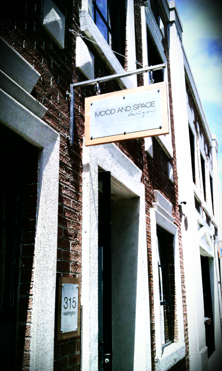
…truth be told, we’ve been “on the block” since January yet somehow it has always been our home. I guess now everyone else will know where our home is.
Digging our new exterior sign – the construction-grade materials are a nod to the industrial port history of the Jack London Square area in Oakland and our adaptive re-use of the 1930s brick electric building. You know how we do.
Come down and check it out! 315 Washington St., (between 3rd and 4th), Oakland, CA 94607
Side-note: You could even do some co-working with us! www.portoffices.com A great way for creative people to be able to afford a professional space and hang out with some really smart and talented people. (And if you get tired of that, we’re down the hall, too!) 😉
…that being said, many, MANY thanks to The Port’s owners and it’s awesome inhabitants. Thanks for believing in Mood and Space when we were mere babes and for your commitment to our wonderful little neighborhood. Thanks for being our little family-away-from-family. (And also, for always being ready for a martini when needed.)
And many apologies for the title reference above. You know I can’t help myself.