![]()
Just. Obsessed.
…that is all.
History and charm beaten right into it.
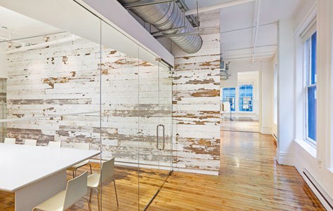
Everything old is new again. What an amazing cycle the design community is beginning to recognize. Barn siding is used for function, beauty, and as a means to conserve. We are digging the trend away from the pointless hipster upcycle (a belt made out of bottle caps? wtf?) and into truly seeing the character of an old, forgotten, construction-grade material. Cheers to Pioneer Millworks for seeing the secret history in an abandoned barn. And for breathing some soul back into modern design.
Michael Hainey.
Thank you, Michael Hainey. A reminder couldn’t hurt.
Get creative.
![]()
#UnBlah
Typical problem, unblah solution:
Remember that amazing Helsinki tile we posted waaaaaa-ay back? Well, we finally got the chance to specify them for a client – and this time in chevron orientation! Double “yay”. Pitched them for a client for their fantastic mid-century inspired kitchen. They loved it.
Luxe marble with dramatic oversized scale…clients are on board…what could be the problem? Well…Walker Zanger just sold the extra few square feet that the tile contractor requested above our original hold. Oh no! A tile with this amount of unblah-factor just is not available anywhere else at the clients’ budget. Of course we had backup options, but they paled in comparison as the whole team was already desperately in love with this specific design.
What is a stubborn team to do? I was hell-bent to make this longtime marbley-chevron dream come to fruition. I thought…why not cut regular square tiles into a chevron? Resourceful idea, if I do say so myself, but as with all things chic and forward, this has enormous potential – to be very pricey. Solution: the team went out and sourced a less-dramatic marble, which saved the client $2000 (!), and now we have the budget for the cuts. Yay. But we’re not past the concerns yet…
Since the tile (although beautiful) is not as dramatic in coloration as the first tile, we run the risk of losing some of it’s edgy impact. Then we think, why don’t we lay the tile in a grey grout instead of the rote white? This way we are emphasizing the chevron pattern and over-sized scale of the tile instead of the coloration, and doing it in a design-forward way.
Problem solved! Go team Mood and Space! The result of our collaboration (and also the fab work of an excellent tile contractor – thanks, Brett!) we have an even better (certainly more creative) plan for the kitchen than the original concept.
What a fun ride, this design life is taking us on! Proud to show you the final result! We took the backsplash all the way to the ceiling in another unconventional twist.
Collaboration. Inspiration. Beauty. Creativity. This is what it’s about.
#UnBlah #Unconventional #Uncommon #UnderstatedNope
Color Splash.
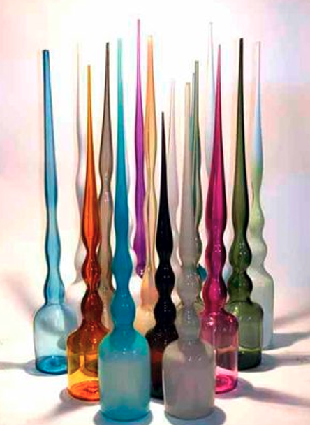
These are a nice way to add color and form, while adding grace (and even a little funk)! I have been thinking about doing a set in all white, then dropping in one with color just to throw it off a bit. Nut Neck vases…I heart Suite NY.